
Design II:
Intro to Graphic Design
EXERCISE: FORM STUDY


This course begins with an exercise in form. Inspired by Martin Venezky’s form studio at California College of the Arts, random everyday objects such as combs, pencils or rubberbands are distributed in paper bags for students to take home and explore its formal properties through photography, drawing, or mark making. Instruction is given to approach the object as if you have never encountered it before and even break, melt, or deconstruct it however you see fit. This exploration forces students to experiment with techniques they may otherwise not of thought of using in design and discover formal properties through the act of a process.
ZINE PROJECT
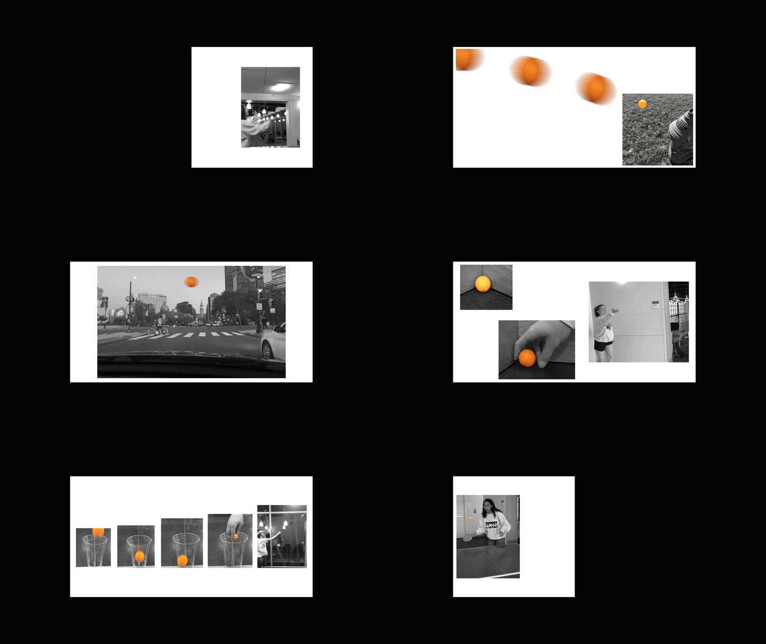
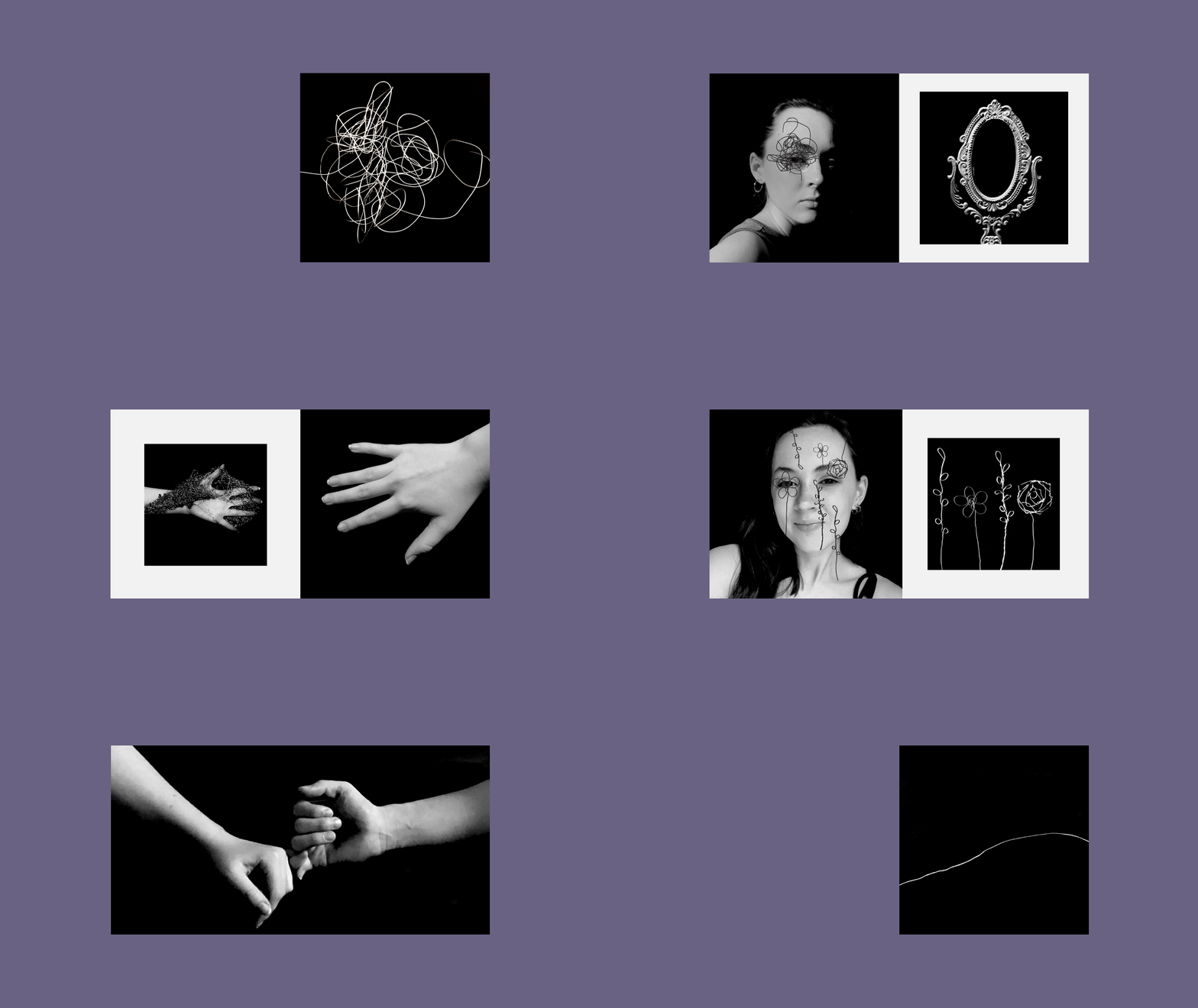
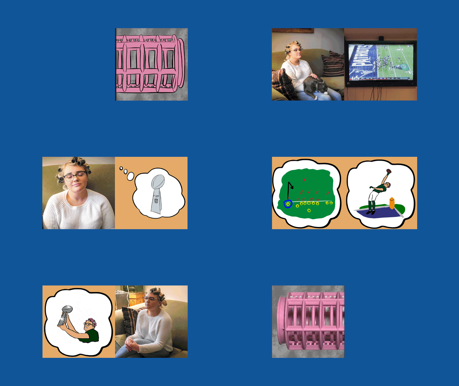
On the first day of class students were given a random object and asked to explore its formal properties. In this project, students were asked to revisit that object in the format of the zine. Using the mediums of photography, mark making, or vector illustration students construct a visual sequence that tells a particular narrative derived from the given object. This could be as simple as demonstrating the objects function (how does it work, why do we use it?) to a narrative loosely linked to the object in someway (who is using it, how is it being used?). That said, we are also interested in capturing a deeper narrative. Are there cultural, historical, geographic, or personal connections that could be layered into the more literal story?
SOCIAL ACTION
POSTER
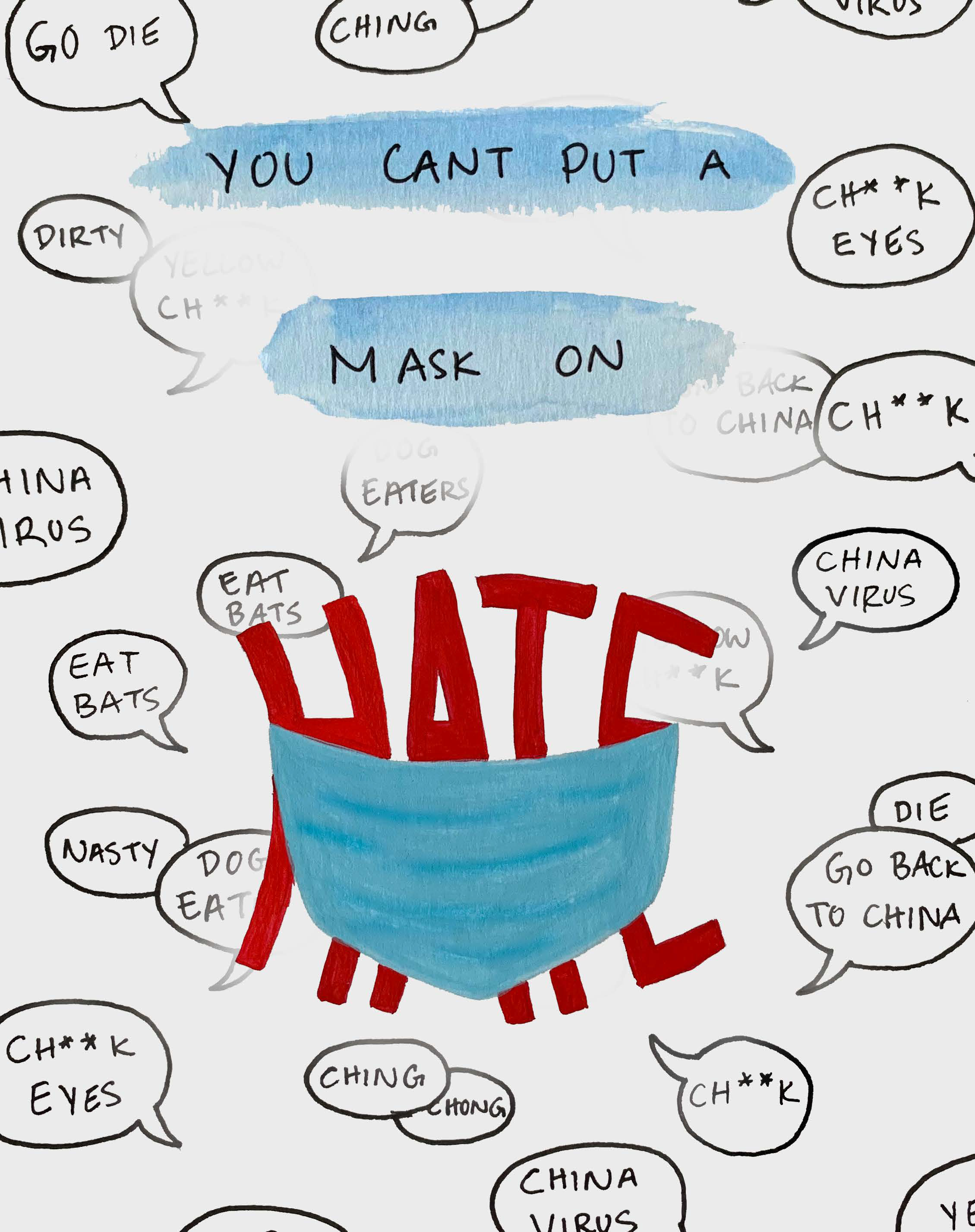
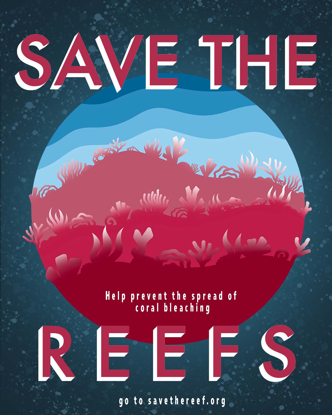
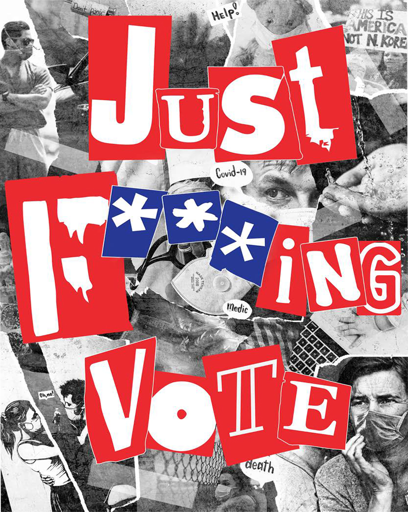
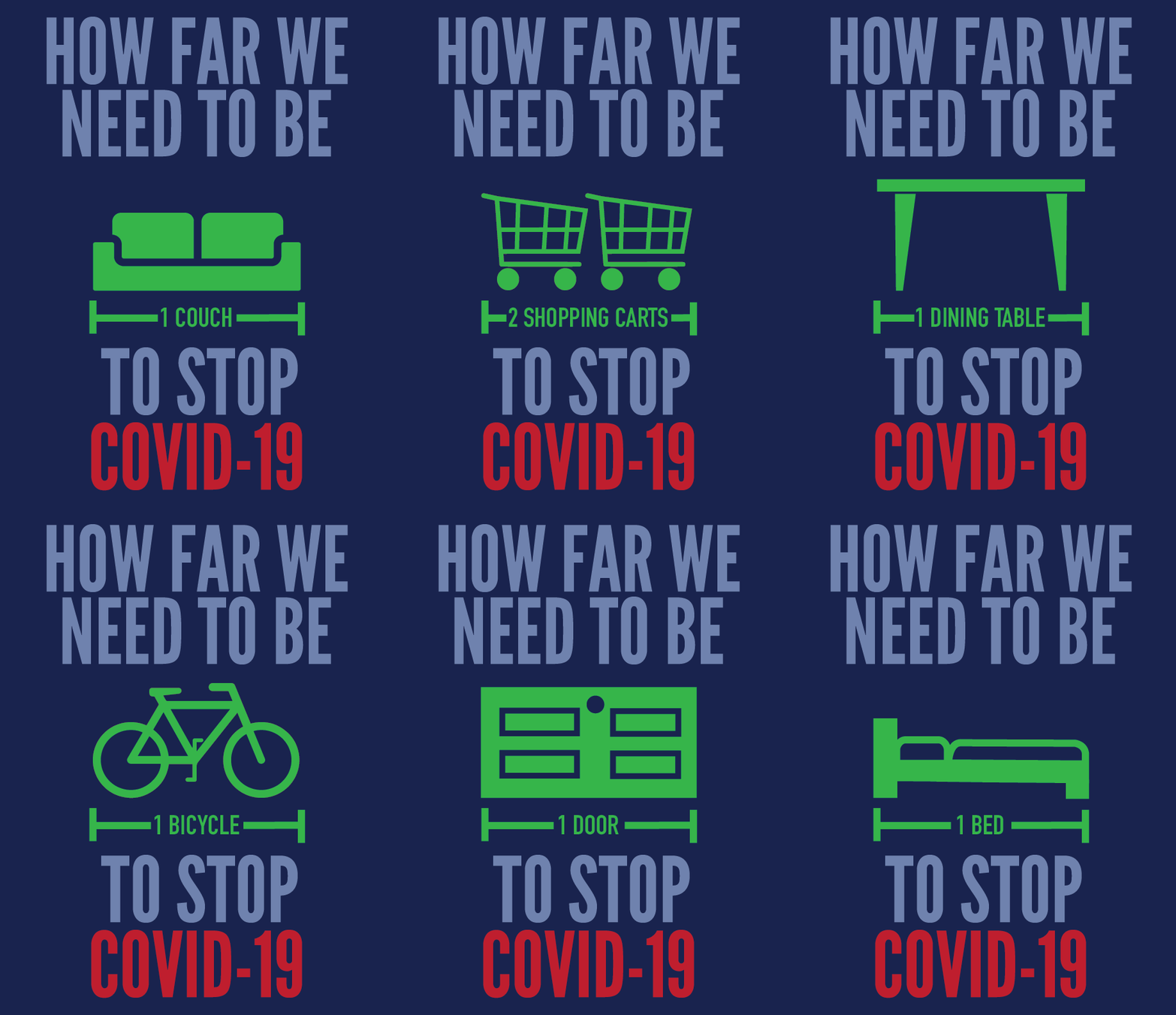
Our final project of the semester has a long and illustrious history within our field—the poster. Students were tasked with creating a poster that addresses a social, political, or cultural issue that they consider important. The choice of how to communicate the issue was entirely up to the student. In Spring 2020, the COVID-19 crisis hit right as the project began. Many of the students chose to tackle this timely topic.
Design III:
Introdution to Typography
FONT MANNERISMS
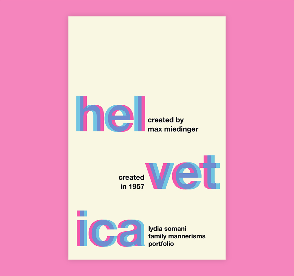

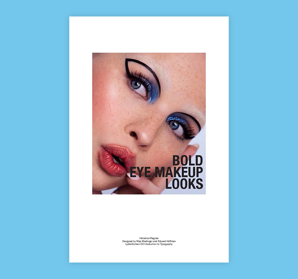


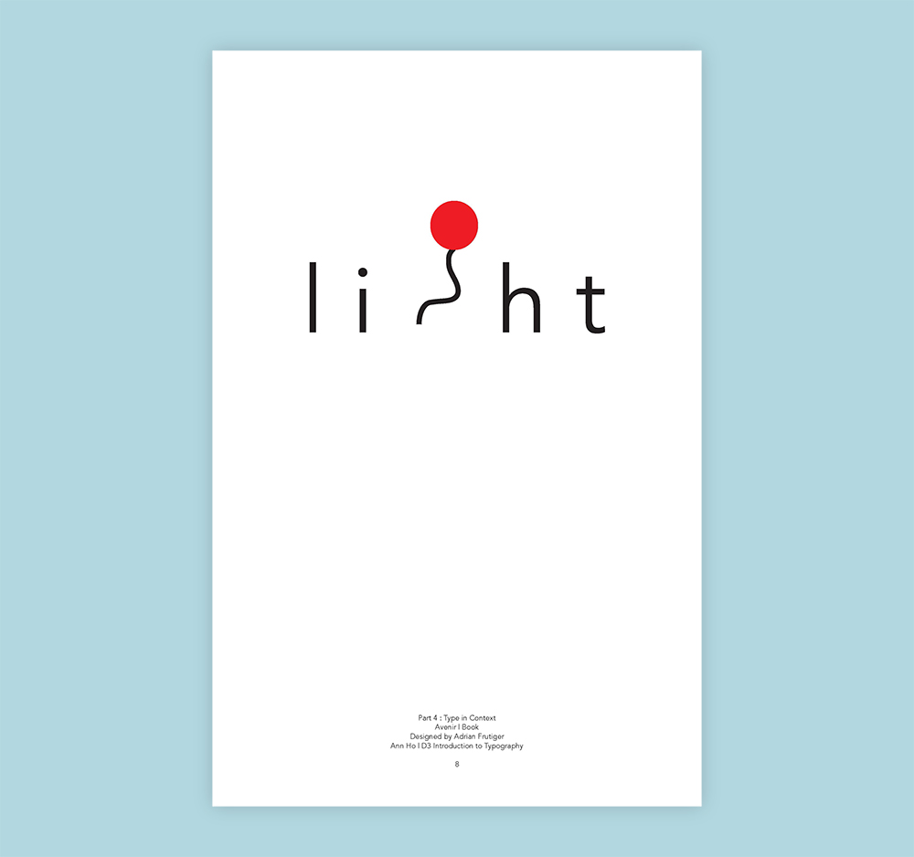

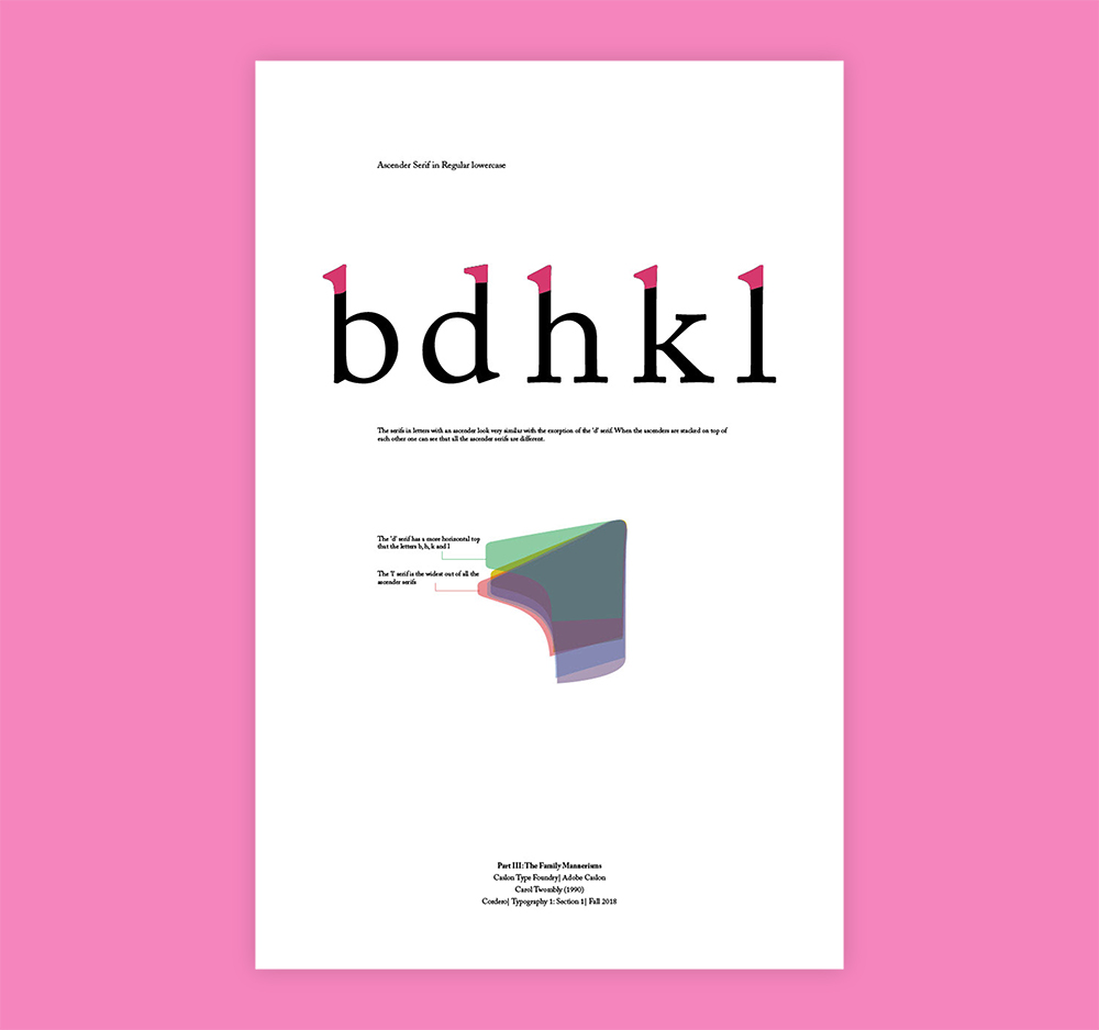


The Font Mannerism Portfolio is a project that I treat more as a series of exercises, to replace some of our more formal exercises that taught specific typography skills in isolation. The Mannerism Portfolio allows students to learn typographic principles and skills while conducting an in-depth study of one particular typeface through examination of its classification and history, character sets, styles, formal attributes, letterform anatomy features, and its contextual usage. I pair this with readings and discussions about connotative and denotative meaning as well as the study of historical type classifications, and type anatomy. I’ve noticed the project allows for deeper discussions and learning opportunities that did not always exist in the purely formal exercises used when I took over the course.
TROPE


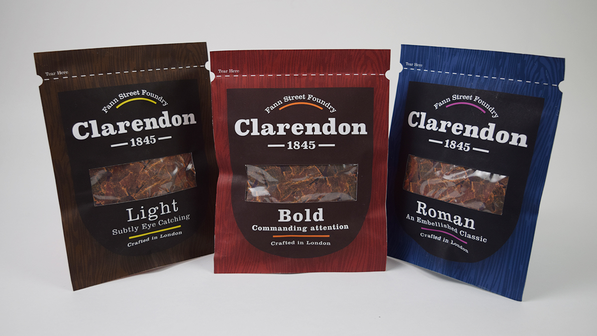


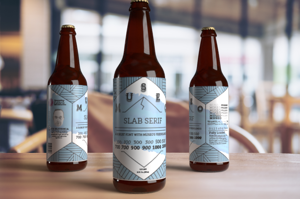

This project, titled “Not a Type Specimen” asks students to identify a “typographic trope”, and then recreate the trope as a type specimen. This challenges students to think critically about how typography in our environments embody messages that send cultural signals through packaging, media, and just about anything that we consume in our society that includes language. The project forces students to understand the different types of roles that typography serves in these contexts, from branding and messaging about the product to informative information such as nutrition facts and barcode numbers.
ALBUM & LYRIC
ANIMATION

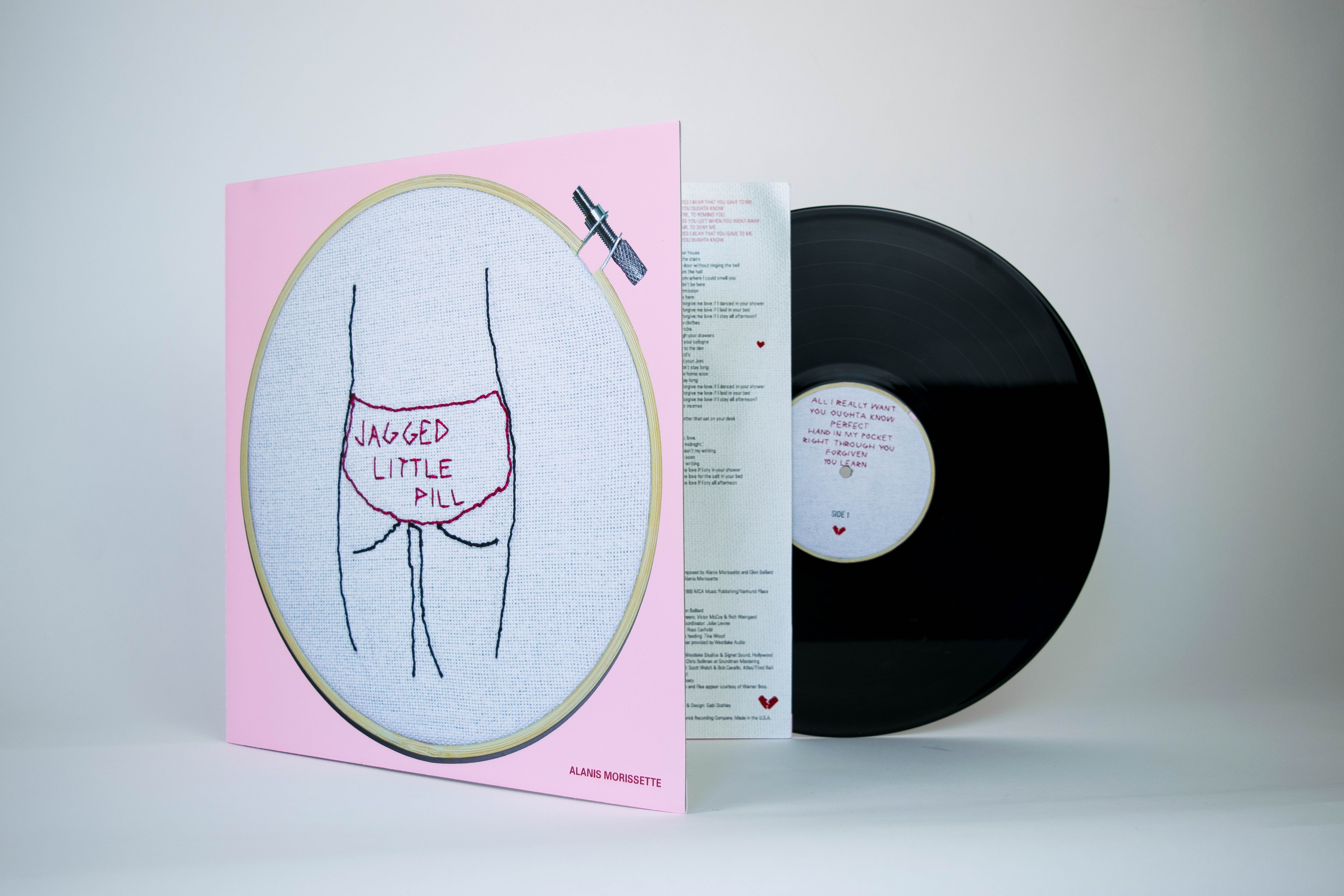

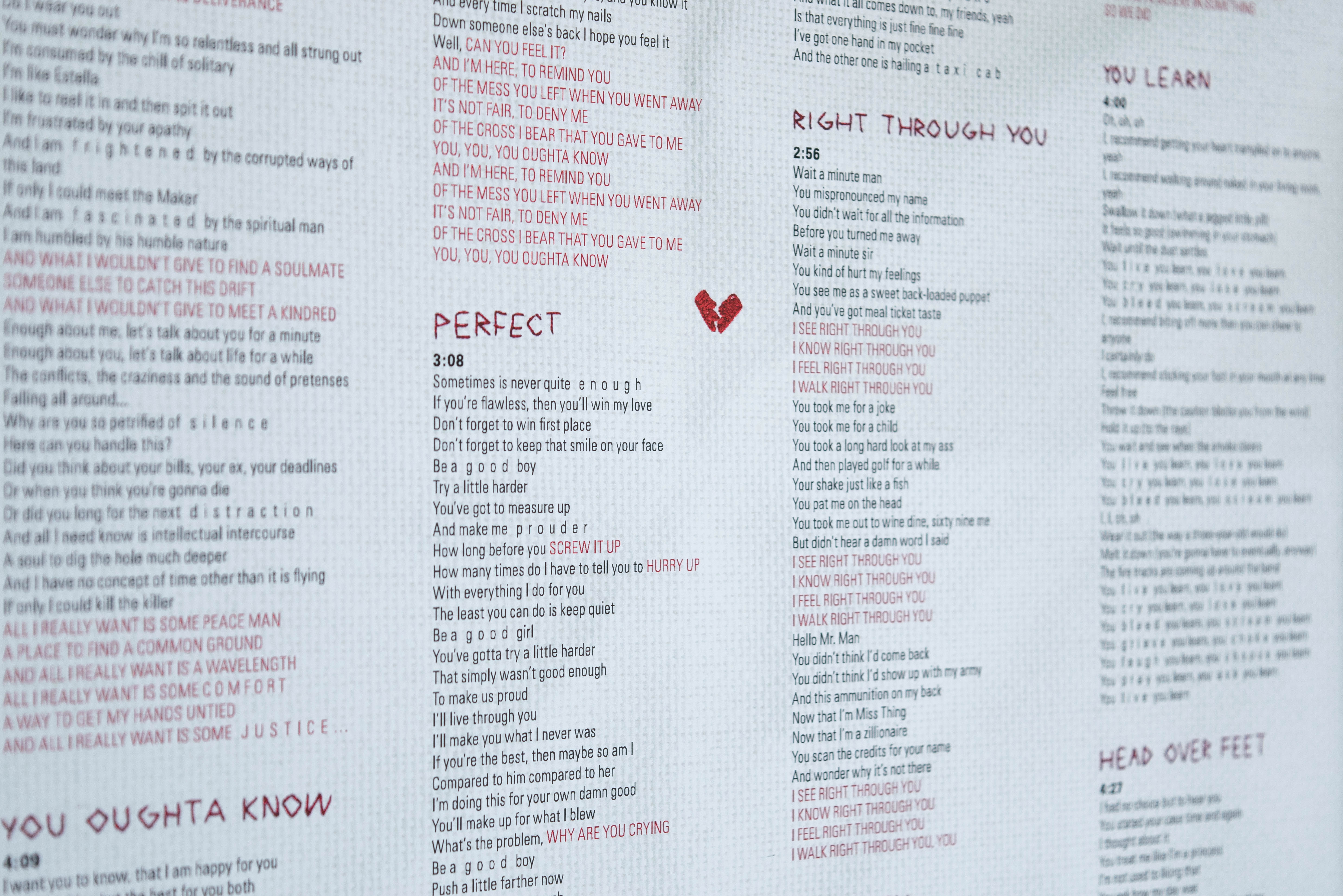


In this ever popular project, students are asked to redesign an LP package. After selecting an album, students are asked to listen carefully to the album and create a mind map based off themes that they find in the music. They then conduct typographic studies around these themes, then put it all together in the package. A recent addition to this project addresses hierarchy in motion, with a lyric animation. Students learn how to create basic animations using illustrator and photoshop.
SYMPOSIUM POSTER
& WEBSITE
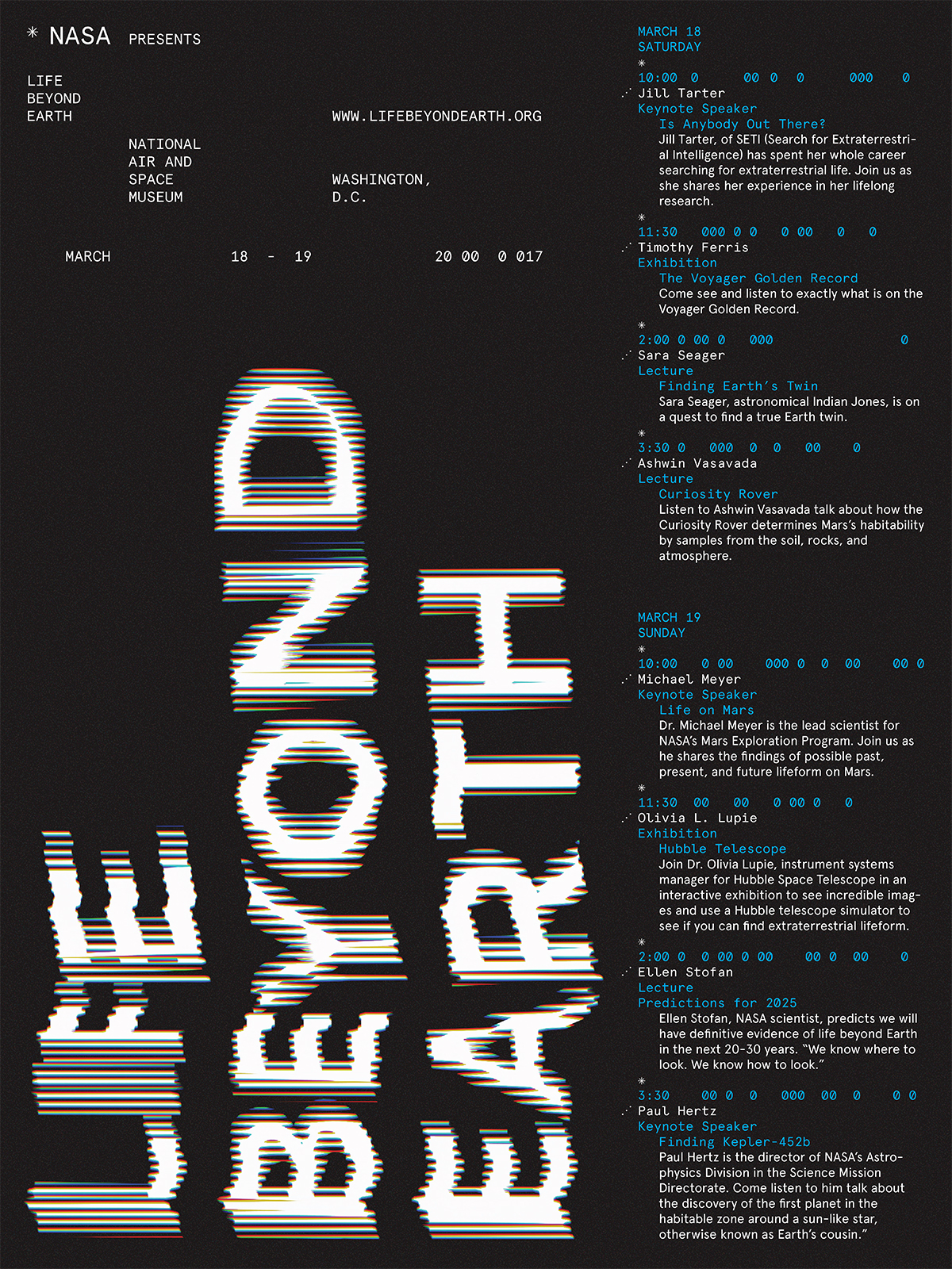

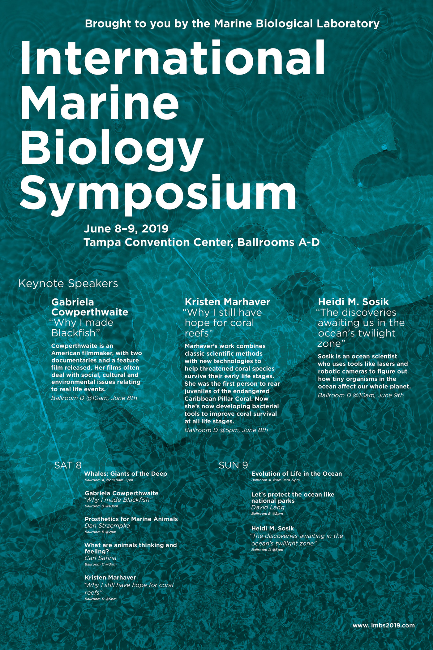
In this poster project, students work together in groups to concept a Symposium on a subject that they know little about. They are then required to pull content together using real leading experts in the field and their infomation. With all the content generated by the group, each student takes on their own design for a poster and website with this information. This introduces them to the typogrpahic problems that arise when dealing with informational text in both print and web formats.
Design IV:
Advanced Typography
This course will build on learning objectives and typographic skills. Emphasis will be placed on the complex interplay of visual meaning and form and typographic sensitivity within a historical context.
WEEKLY LETTER

This is an ongoing generative exercise that should spur your process and making skills while allowing you an opportunity to explore and experiment with the form of the letter. The rigor of creating on a regular basis and sticking to one particular form should yield a robust body of work that could become many things: a book; an ongoing website; cards; etc.
INFORMATION KIOSK


For this project, students pair a location of their choice with a researched concept to engage an audience in a visible and public context. The concept should connect in some way to the space you chose, whether it is a awareness campaign, an historical account of an event, or narrative of the space. Consider how you can activate the space; encourage someone to respond to your information; change someone’s relationship with the space; change someone’s point of view; and/or alter someone’s experience in the environment.
COLLECTIONS BOOK


Design an Exhibition Catalogue to accompany a (fictitious) exhibition held at the Design Center at Philadelphia University. The collection on display at this exhibition is of your own concept and curation.
Design VII:
Systems Design
DESIGNING FOR
HEAT EMERGENCIES
IN PHILADELPHIA
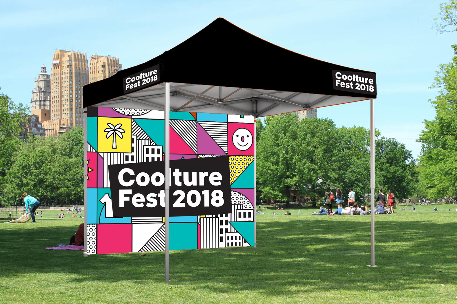

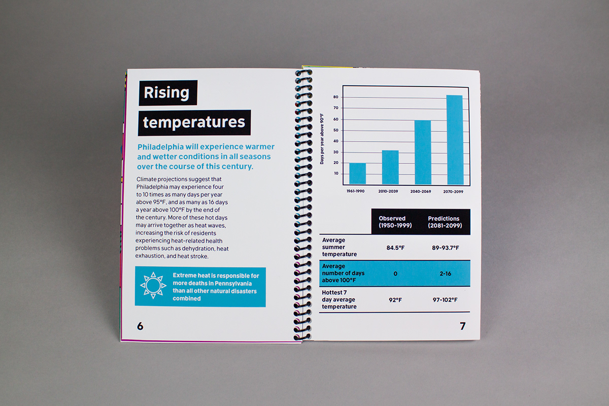
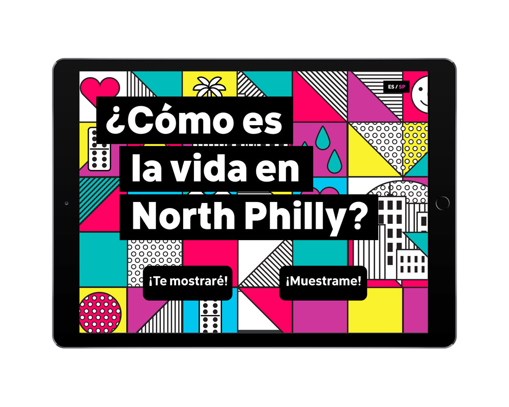
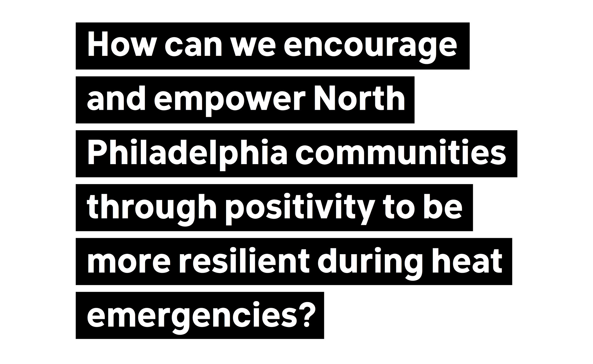
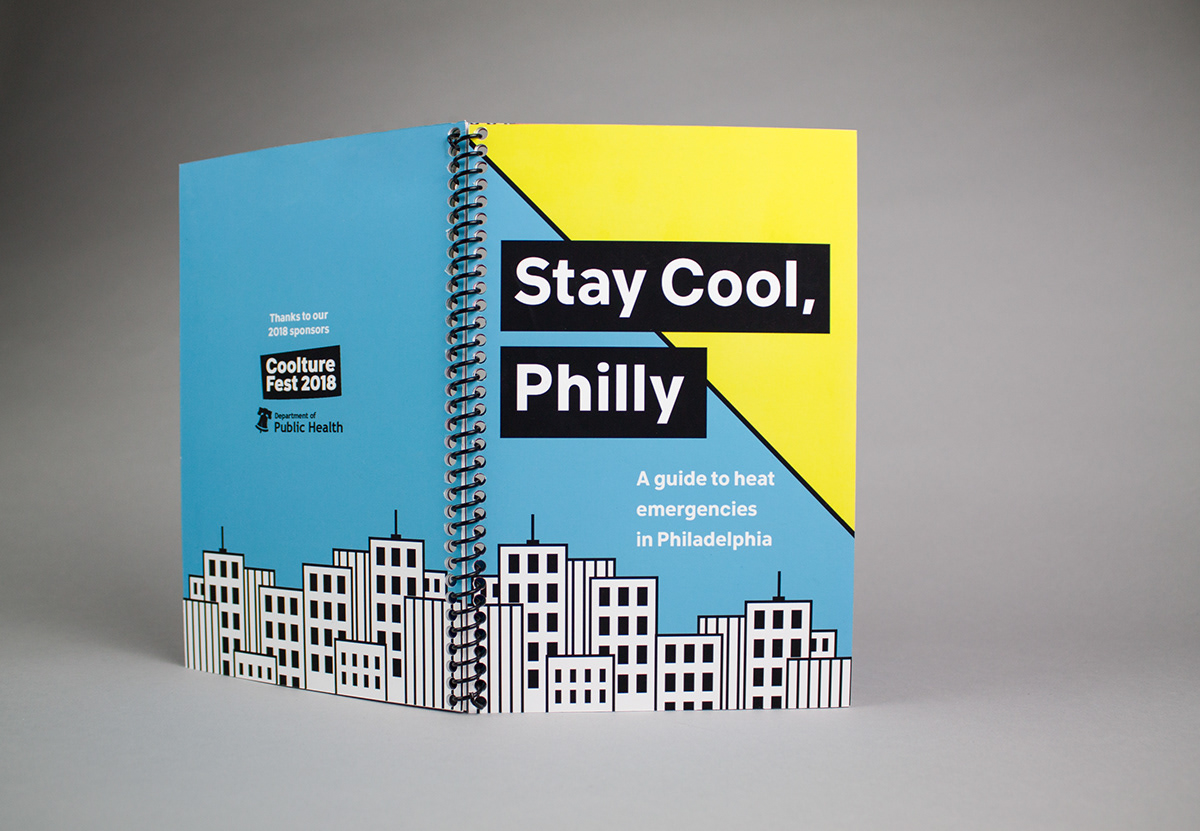
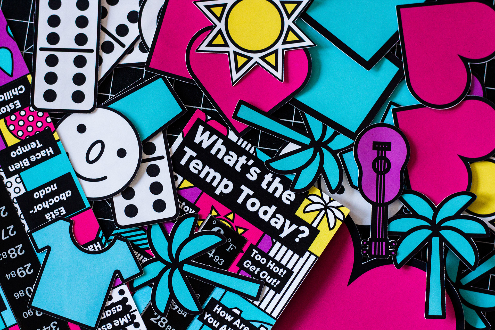
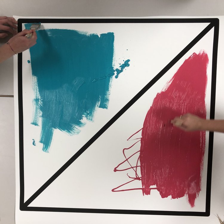

In a collaboration with the Philadelphia Department of Public Health students were tasked with creating a design system that would help Philadelphians’ better prepare for rising temperatures. This semester long project consisted of an extensive research phase that required students to conduct their own human centered research before and during the design process.
CONTROVERSY
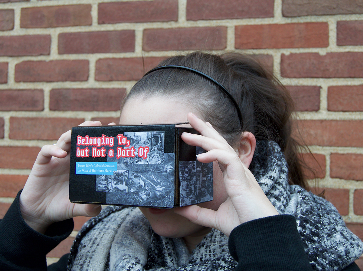
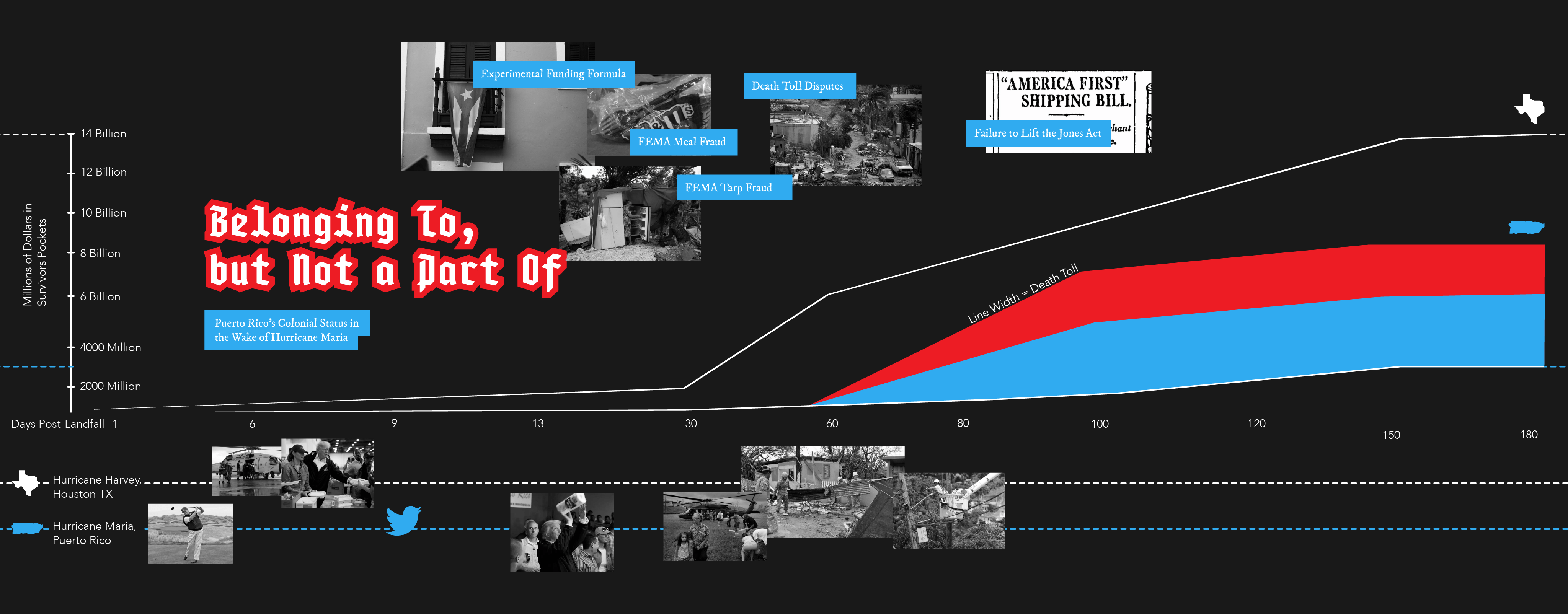


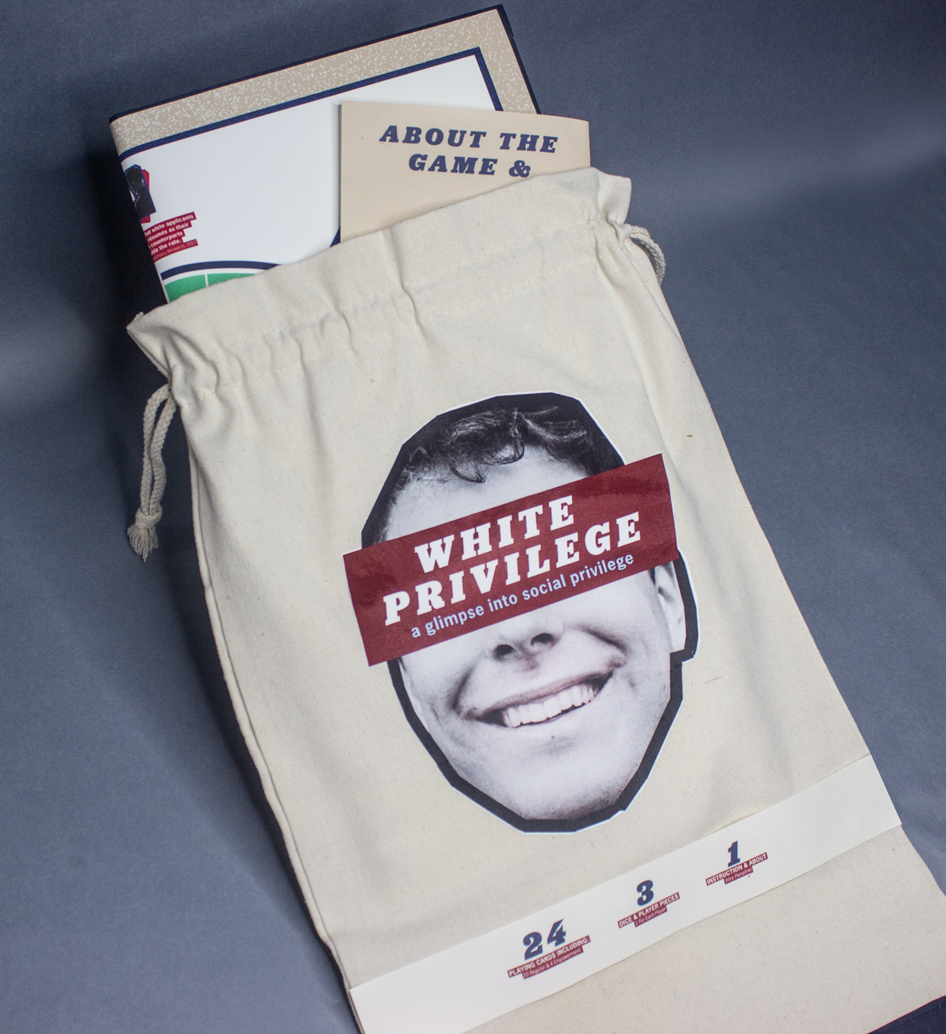

Issues in Information Design
COVID-19 REPORT

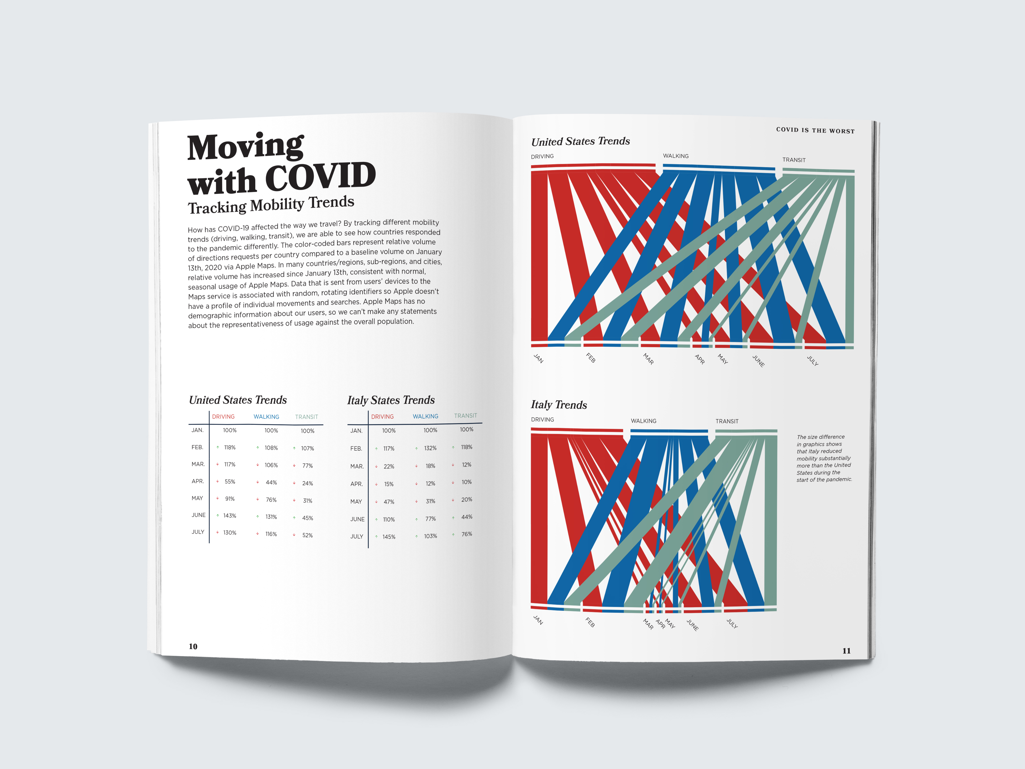
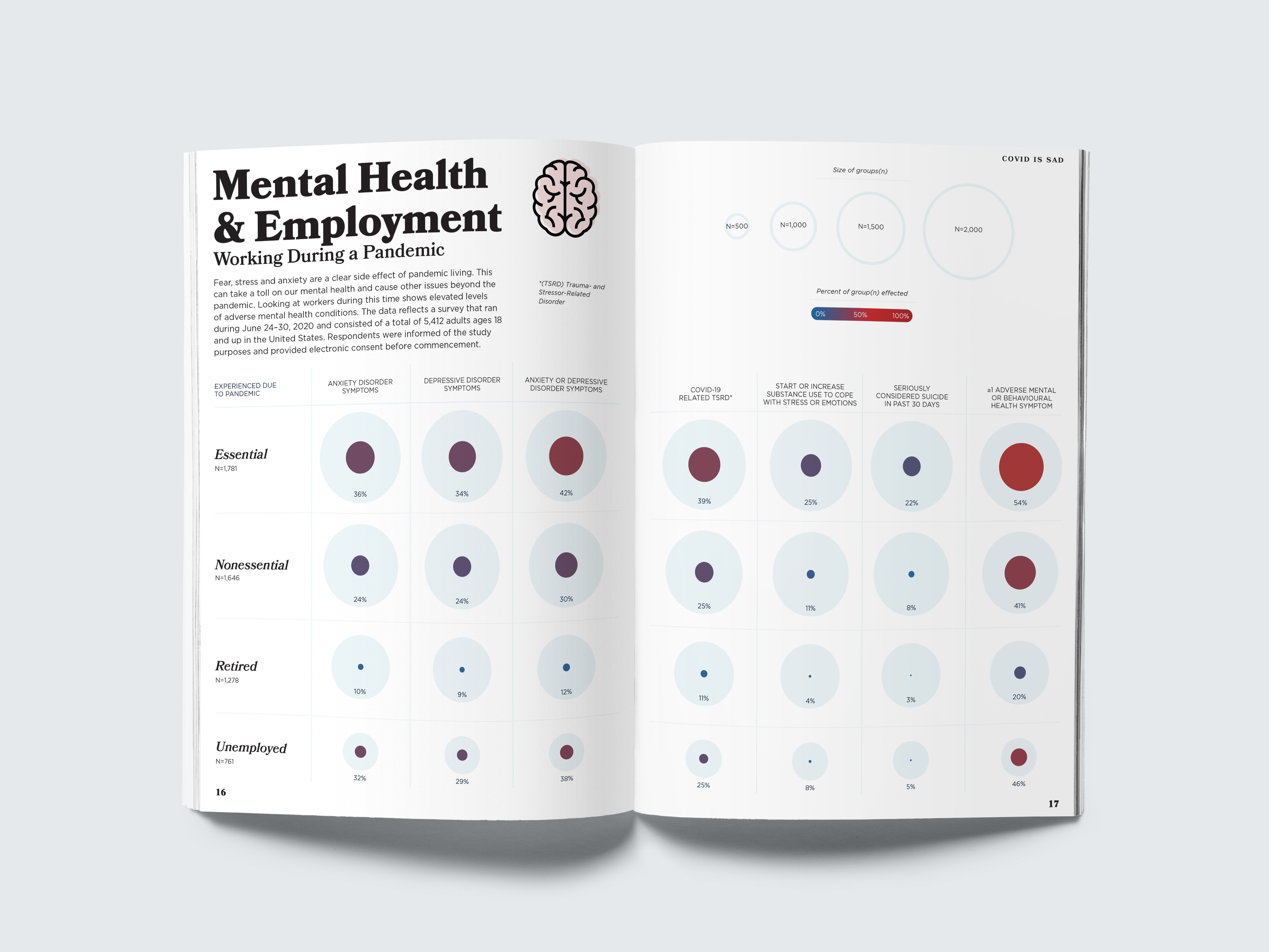

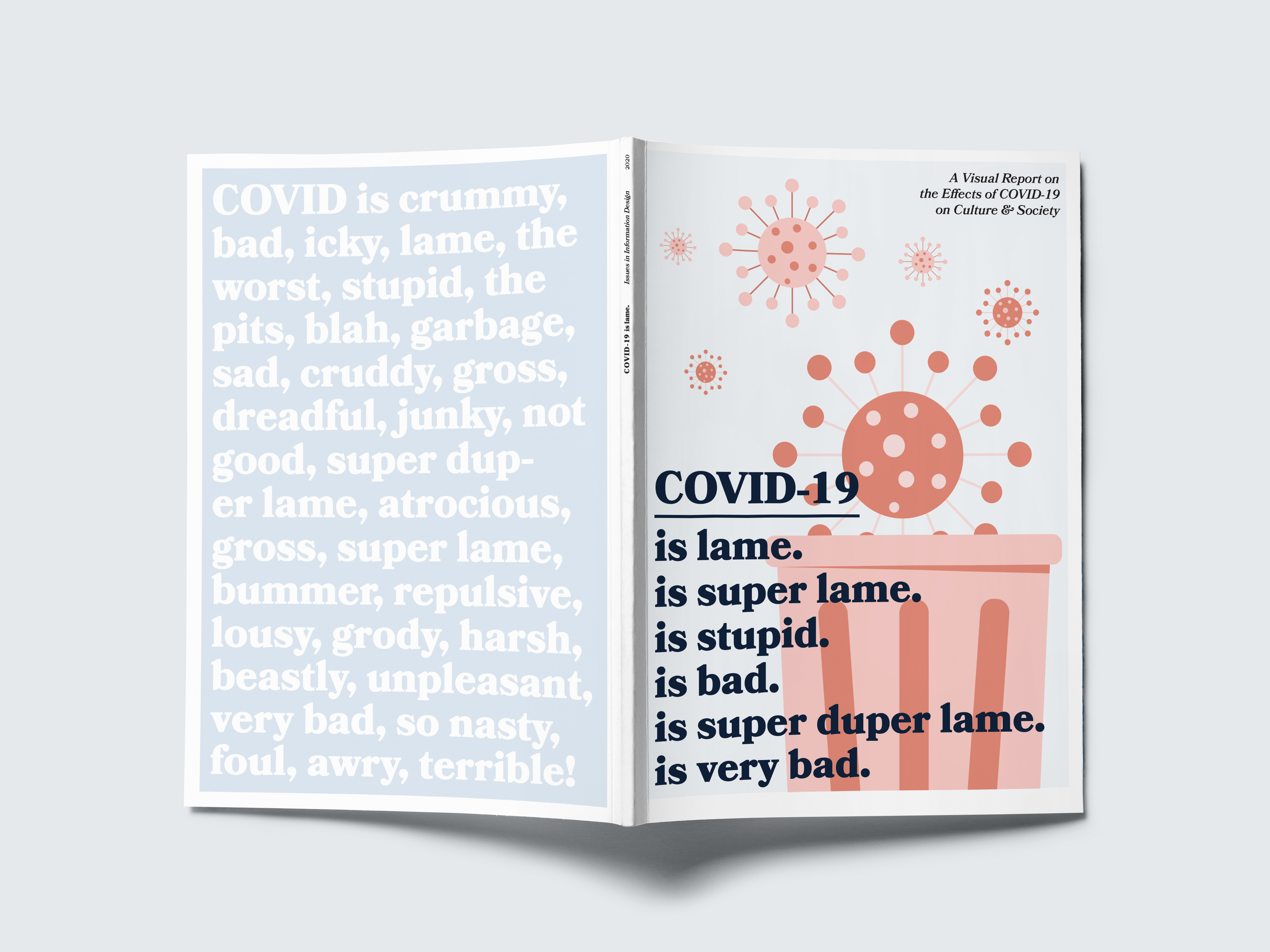
We have all become accustomed to looking at charts that graph the toll COVID-19 has on the human population and the healthcare system. But what about everything else that this pandemic has affected? Students of the Undergrad Visual Communication Design elective Issues in Information Design and the Master’s elective Communicating Health Data came together to use data and design to ponder this question. Thorugh study of the pandemics’ peripheral effects, they uncovered how these effects shape and influence our culture, society, economic, and social behaviors.
BIODIAGRAM
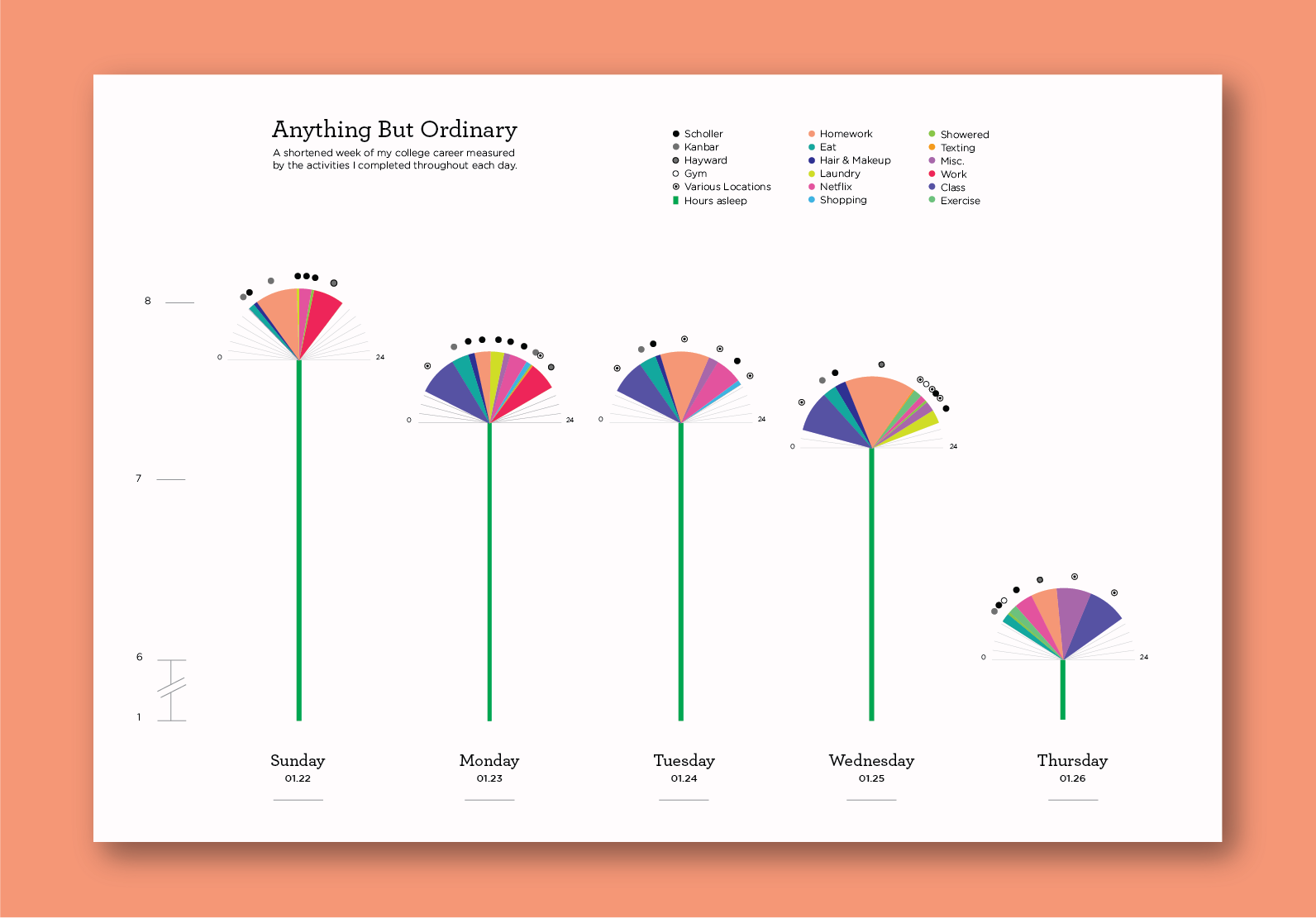

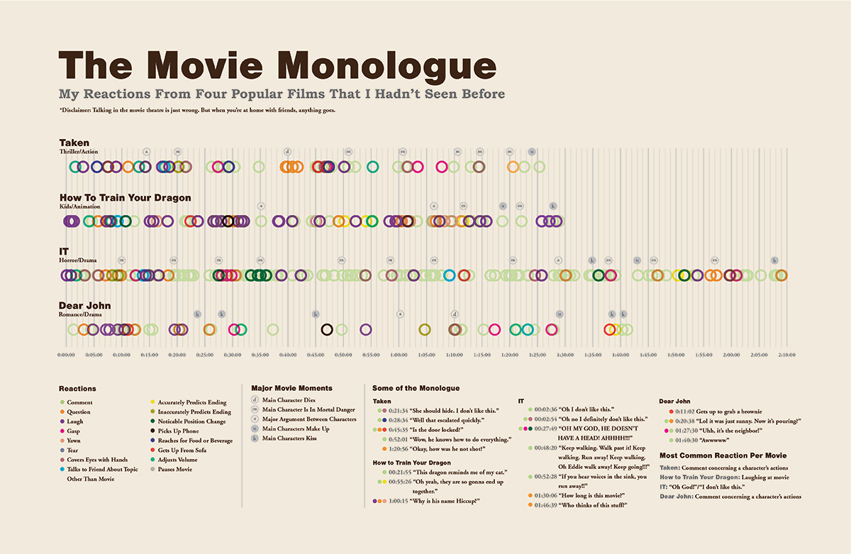

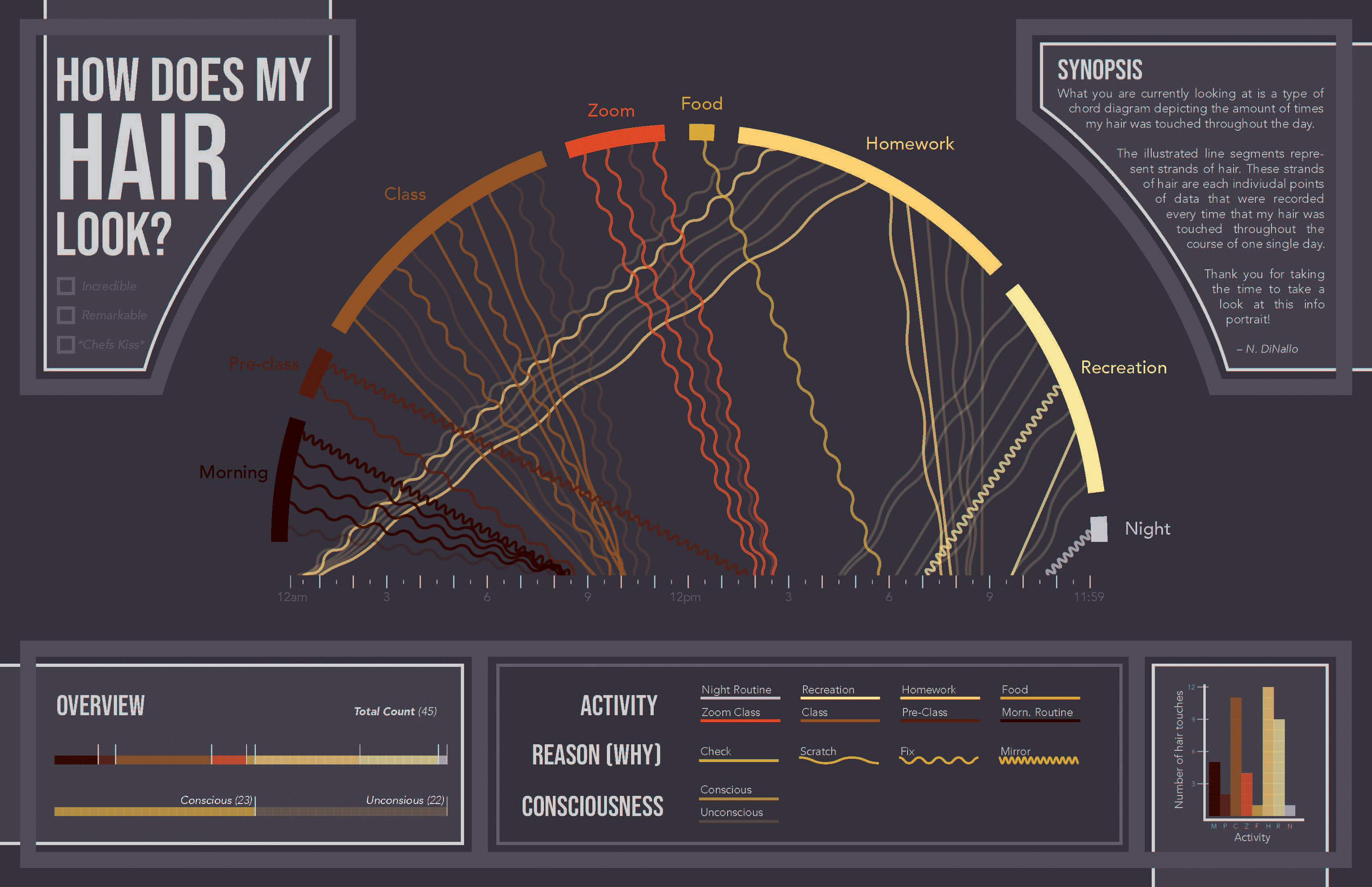
This project introduces students to the basics of creating a diagram. We start by learning the five basic principles of organization for information—Location, Alphabet, Time, Catagory, and Hierarchy. Students then use these organization methods to construct a diagram that tells a story about themselves.
CARTOGRAPHY
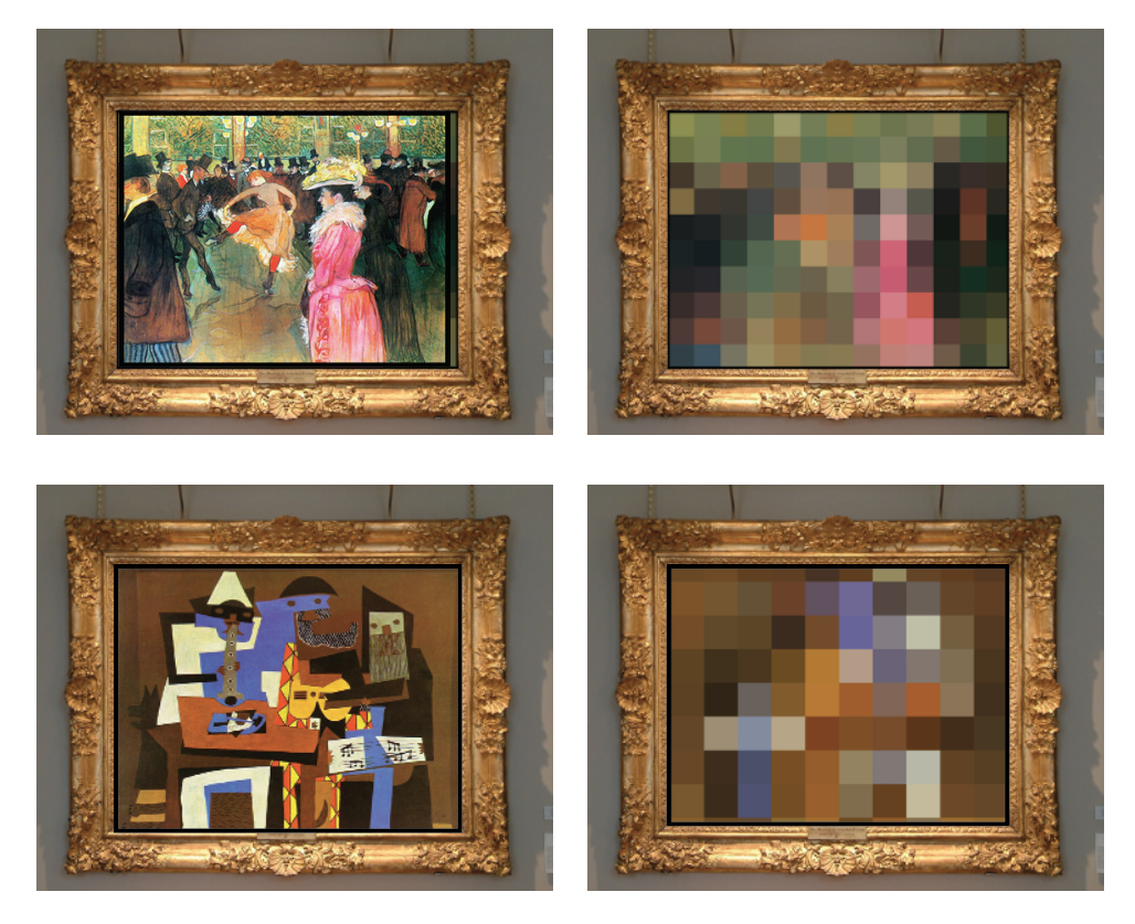
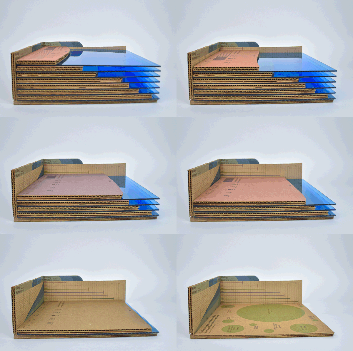
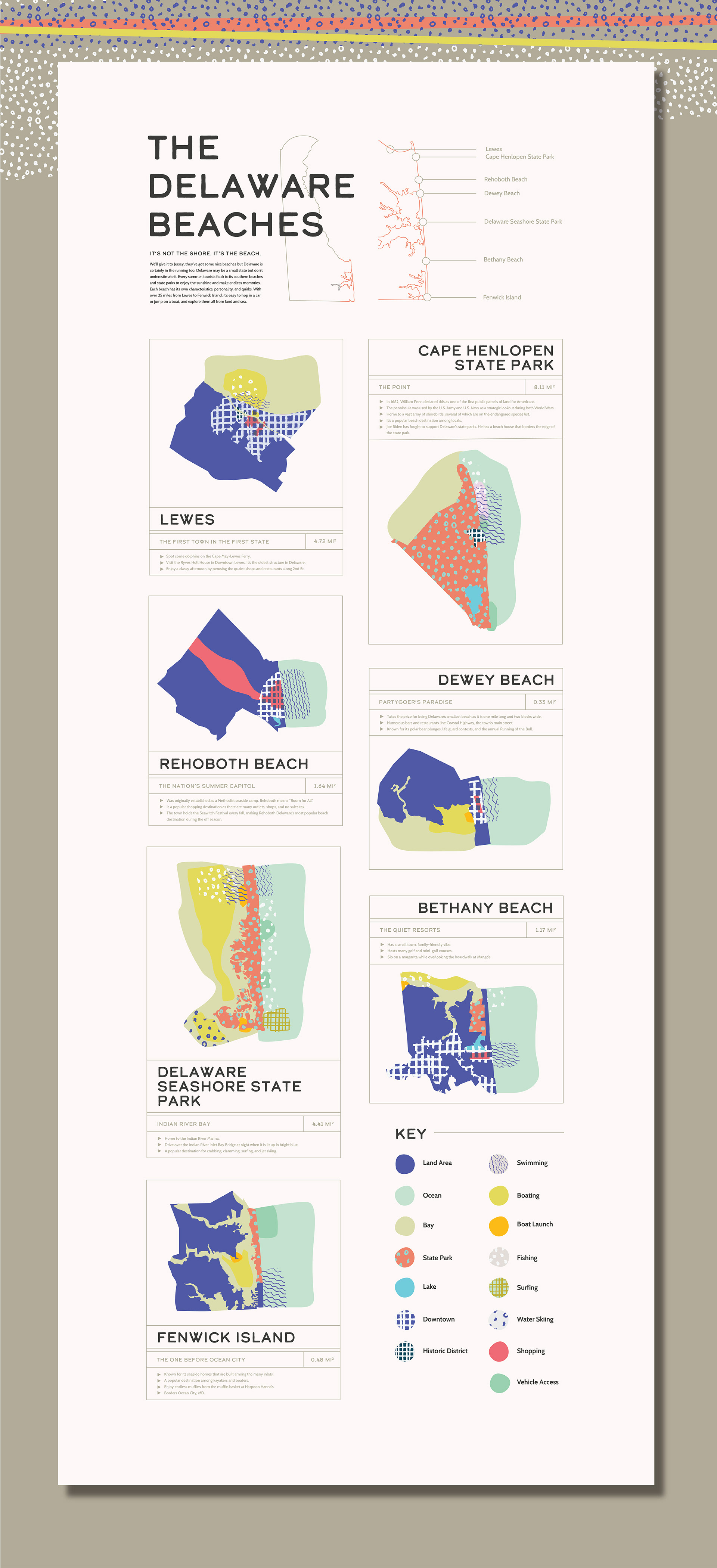
For this project, students chose a uncharted territory to map. It can be a conversation, a natural phemnomena, a social network, or painting. The format is up to them, they are encouraged to explore physical, digital, and motion based solutions.
COMMUNITY HEALTH
REPORT
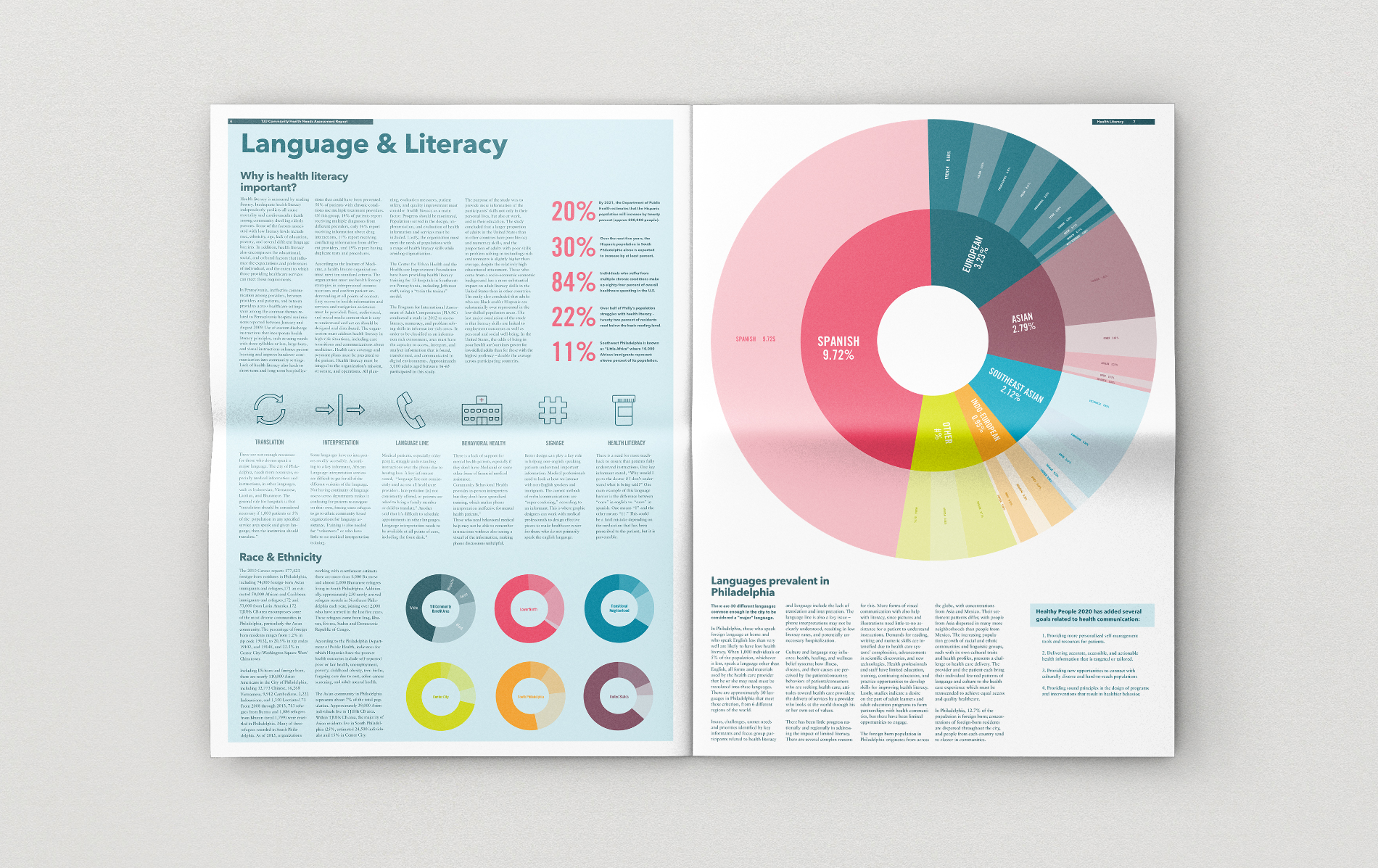
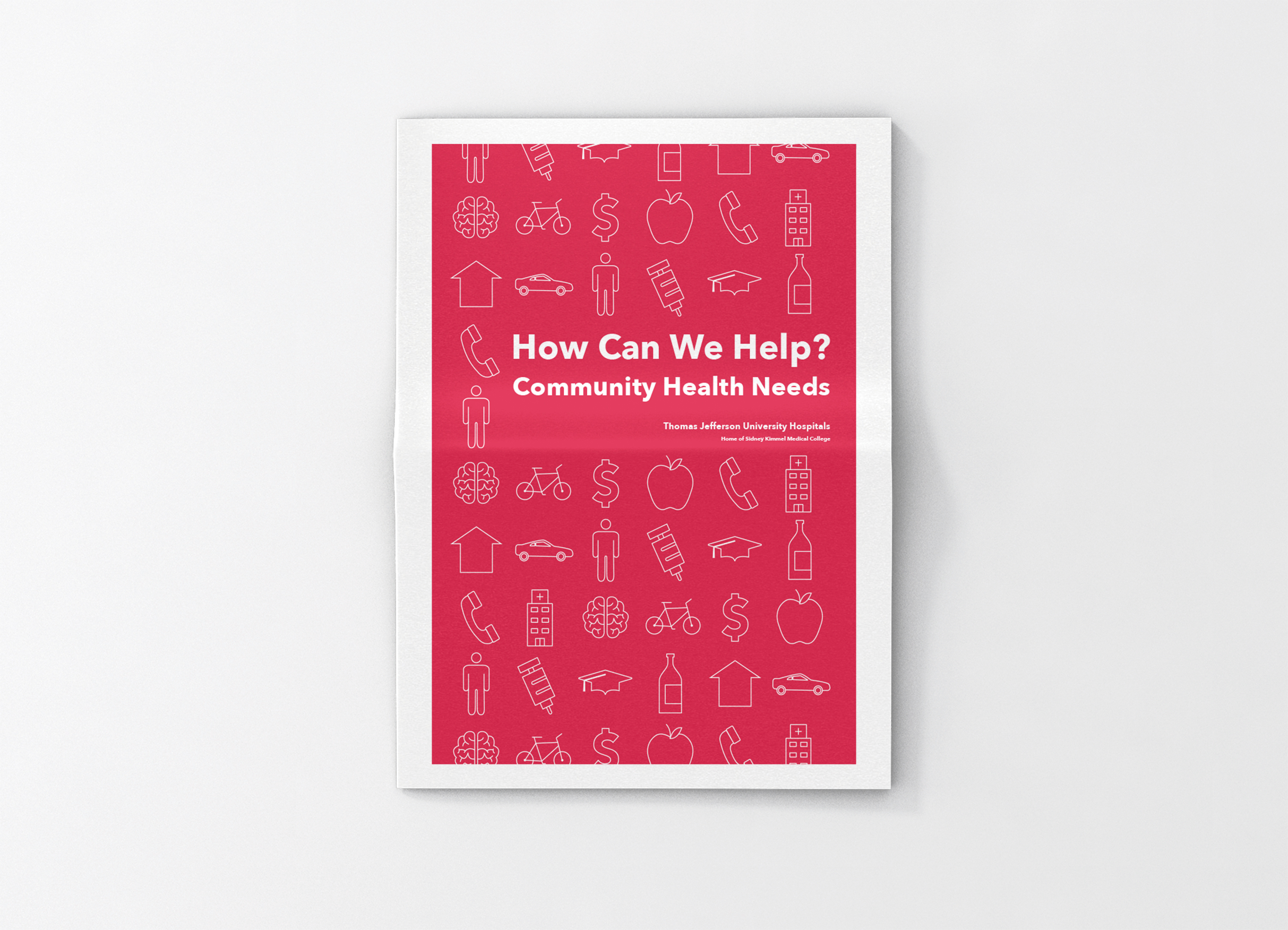
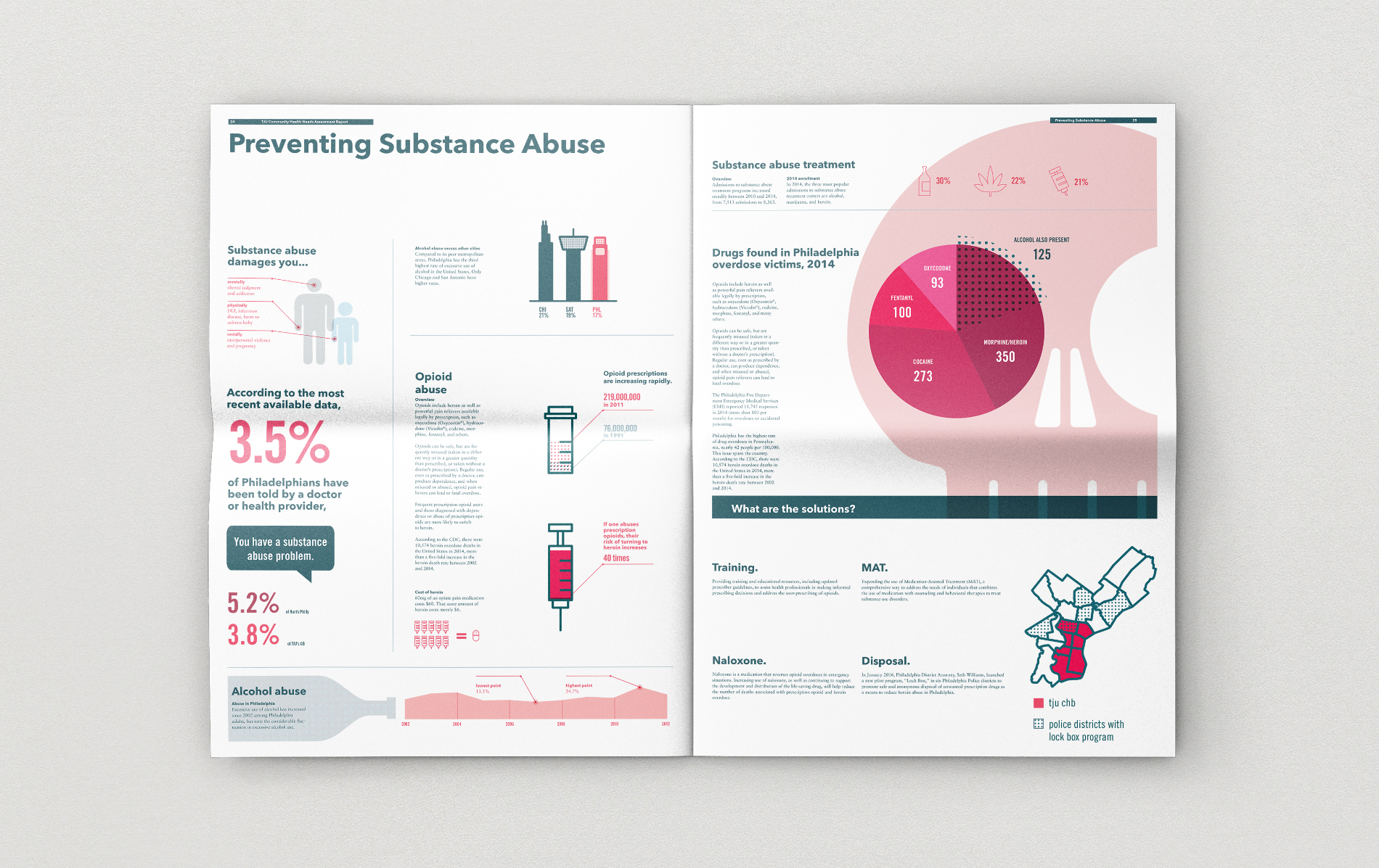

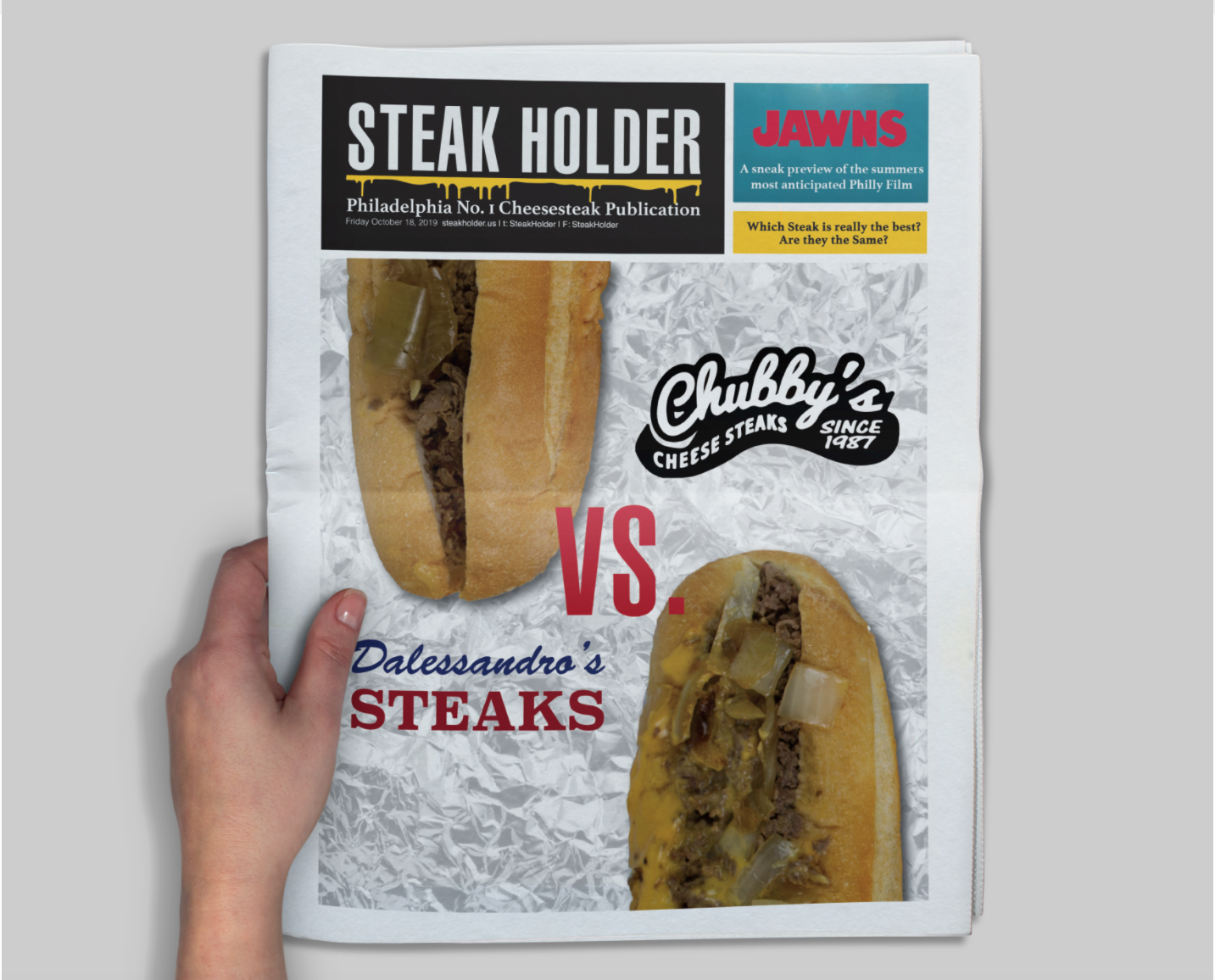
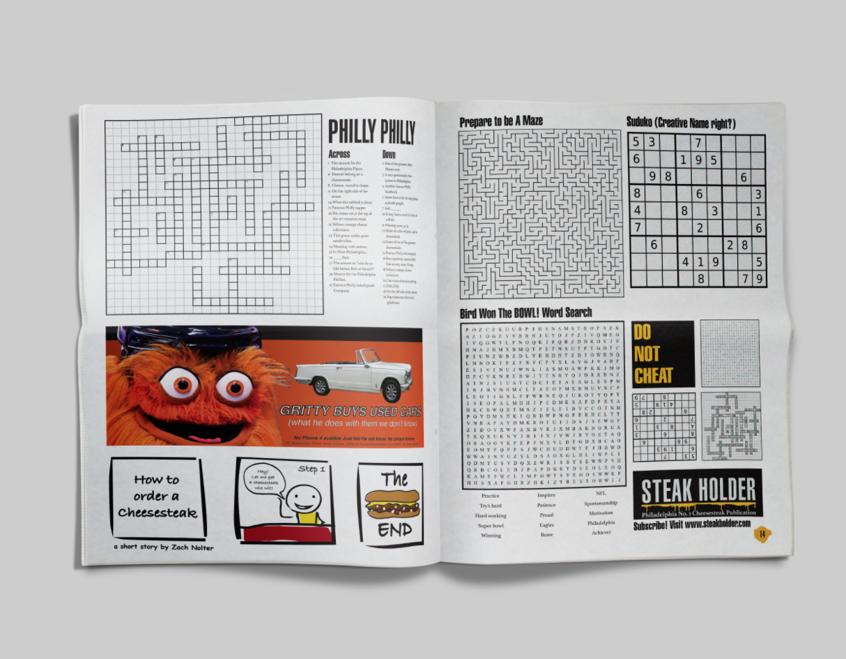
In a collaboration with the Jefferson Center for Urban Health, students each took on a topic covered in the report and represented the data provided in a visual explanation. Solutions ranged in approach from visual breakdowns of languages spoke by the community to maps displaying economic density in Philadelphia’s neighborhoods. A dissection of the sodium levels the Philadelphians’ favorite cheesesteak helped make the content relatable to the community. Students collaborated to come up with a look and feel for publication in a broadsheet format.